
You’re about to learn how I used footprint charts to help reinvent my trading career. This is after I had already made 7 figures as a trader!
After reading this post you will understand the critical edge footprint charts provide to help build context around your trades, validate them, and improve your entries and exits.
The Need for Footprint Charts
In 2008, I was 5 years into my professional trading career at GPC in Chicago. The majority of us at the firm were pure Level II traders.
A Level II quote gave us the ability to read order flow as well as determine logical levels for stops and take profits.
I would use the Level II in order to determine when large buyers or sellers were entering the market creating imbalances as well as to identify key support and resistance levels.
I profited by following other time frame traders as they entered the market or by taking out S&R levels that I knew a lot of short term traders were leaning on as their out. I would cover my position into their panicking.

Then things changed, real quick… In 2008 algorithms began to account for a majority of trading volume. The algo’s resulted in a lot of false or fake orders being advertised in the Level II that would get pulled, making a Level II MUCH less transparent and very difficult to read.
Like most other pure Level II traders, I reached a point where I had to develop new strategies or my career would have been over.
Introducing Footprint Charts – Key Concepts
Footprint charts brought market demand and supply back to life for me. Footprint charts allow you to interpret order flow, similar to how I used Level II quotes in the past. Let’s take a look at some of the basics and how to read a footprint chart.
The price of any security depends on whether you wish to buy or sell.
When you want to buy a security the price you will pay is the Ask (price the counter-party is asking). If you wish to sell, the price you will receive is the Bid (price the counter-party is bidding).
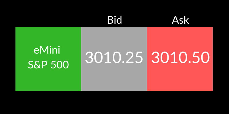
In the example above, if you were looking to sell a eMini S&P 500 contract the price you would receive is 3010.25. If you were looking to buy you would pay 3010.50.
Note: The act of buying with a market order is known as taking the offer or lifting the ask. The act of selling with a market order is known as hitting the bid.
Next let’s take a look at a Trading DOM, which stands for Depth Of Market. This display shows all of the resting limit orders in the market (Advertised Prices).
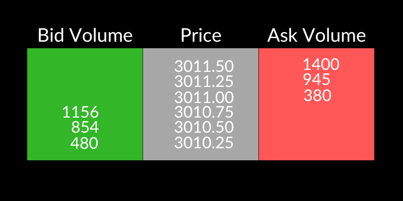
In the example below, the current market on the ES (eMini S&P 500) is 3010.75 by 3011.00.
Sellers are prepared to offer 380 contracts for sale at 3011.00 – the Ask price.
Buyers are prepared to purchase 1156 contracts at 3010.75 – the Bid price.
Since the introduction of algorithms a lot of the orders resting in the book will never trade. The algorithms constantly add and pull orders reducing transparency.
Footprint charts give us the ability to see the data that we’re actually interested in, executed orders. Not the transactions that are being advertised on the DOM.
Note: Throughout this post I will be referencing the eMini S&P500 as it’s the primary contract that I trade. However, footprint charts are valuable when trading any market including equities, forex, oil, digital currencies, and gold.
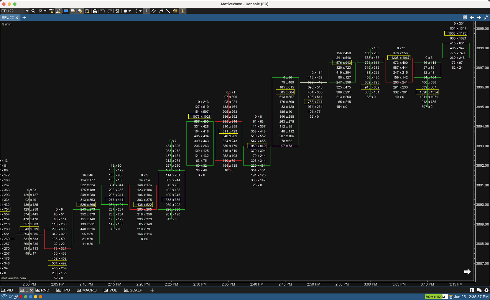
The chart above is a very basic footprint chart (Bid/Ask Footprint) of the ES using a 5 minute time frame.
Let’s zoom in and study the ins and outs of a footprint candle.
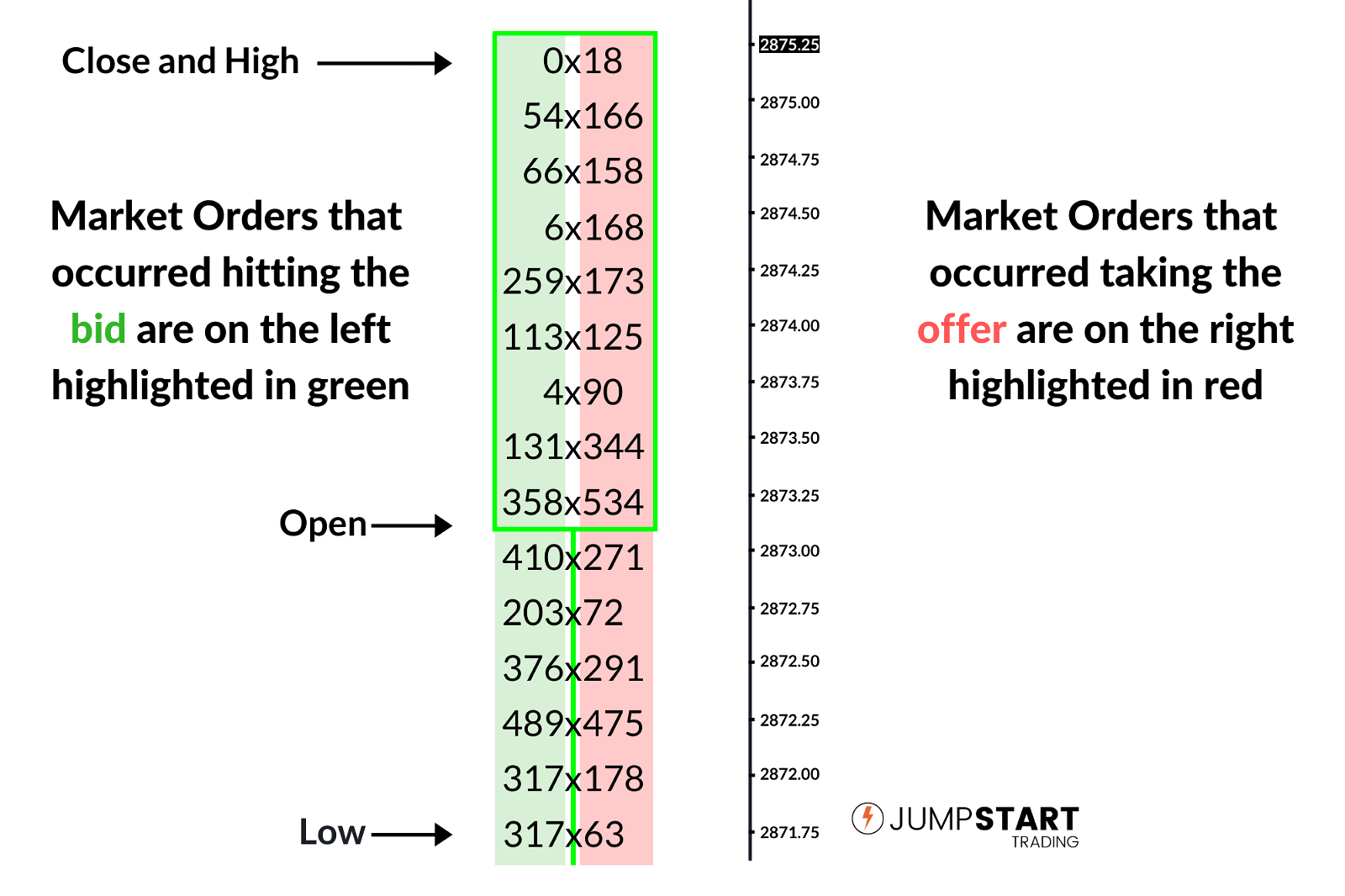
On the above candle, the closed transactions highlighted in green is the amount of volume that occurred as a result of market orders hitting the bid.
The volume highlighted in red occurred as a result of market orders taking the offer.
Also notice the candlestick outline designating the Open, High, Low, and Close for this bar.
Considering a price quote is made up of a bid and an ask price, you have to look at the chart diagonally.
When the price quote was 2874.00 x 2874.25, 113 contracts traded on the bid at 2874.00 and 173 contracts traded on the offer at 2874.25.
Point of Control (POC)
The Point of Control, also know as the POC, is the price level where the highest level of volume traded for a given session.
On the chart below you will notice yellow rectangles highlighting the POC’s of every 5 minute session.
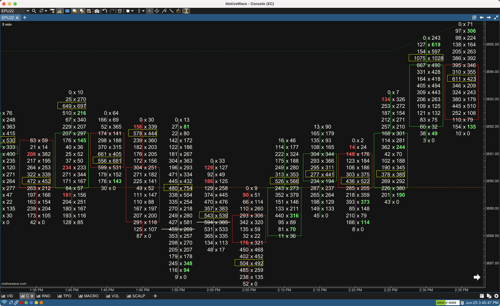
We will use the Point of Control to help tell us determine whether buyers or sellers are the aggressor during a given session and to designate areas of support and resistance.
Buy and Sell Imbalances
What makes the price of security move? It’s pretty simple… the aggression of buyers and sellers.
If the buyers are more aggressive than the sellers price is driven up. If the sellers are more aggressive price is driven down. AMT Theory 101.
Wouldn’t it be useful to be able to quickly visualize when large buyers or sellers are entering the market? You can!
To do this we can look at buy and sell imbalances on a footprint chart.
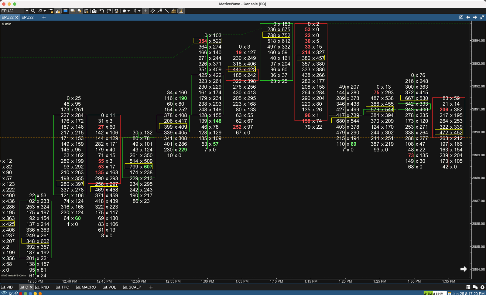
On the above chart you will notice some of the volumes highlighted in green or red.
The ones highlighted in green are buy imbalances because they occurred on the offer and were over 300% higher than the corresponding bid.
The ones highlighted in red are sell imbalances because they occurred on the bid and were over 300% higher than the corresponding offer.
Note: 300% is what I use for my buy and sell imbalances. Most charting packages allow you to change this.
Let’s take a closer look at the candle that formed at 12:50.
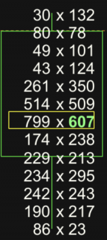
You will notice a buy imbalance highlighted in green of 607. A total of 607 trades took place on the offer versus 174 trades that took place on the bid.
607 / 174 = 3.49 which is an imbalance of over 300% so the bid is highlighted green.
Footprint Chart Types
Footprint charts come in several different types and variations. If you decide to incorporate them into your own strategies, odds are you will use multiple variations. Let’s take a look at the main ones and discuss each of their benefits and how you can use them.
Bid/Ask Footprint
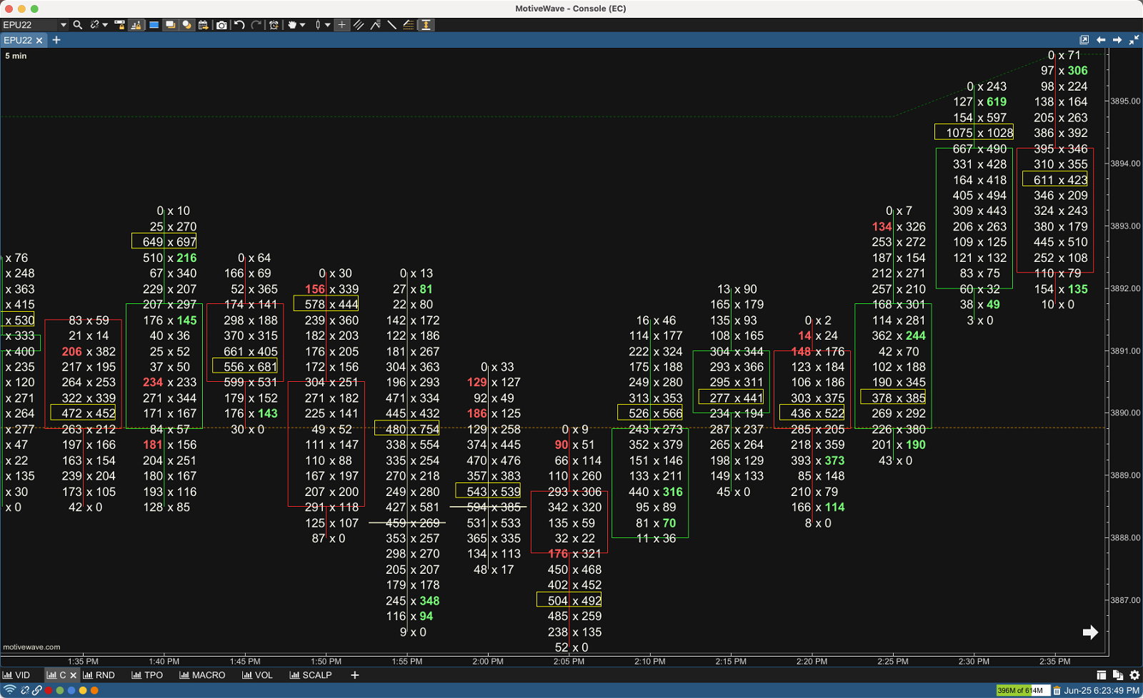
The most common Footprint Chart is the Bid/Ask Footprint. (above) It should look familiar because it’s what you’ve seen so far.
The biggest benefit to the Bid/Ask Footprint is to be able to see buy and sell imbalances. We will go over some examples of how you can use imbalances shortly.
Delta Footprint
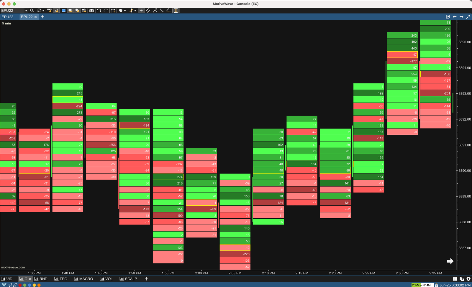
Volume Delta is the difference between buying and selling power. Volume Delta is calculated by taking the difference of the volume that traded at the offer price and the volume that traded at the bid price.
Volume Delta = Offer Volume – Bid Volume
If delta is greater than 0, buyers are the aggressor as more contracts traded on the offer than the corresponding bid.
If delta is less than 0, sellers are the aggressor as more contracts traded on the bid than the corresponding offer.
The bid/ask chart we just looked at is the exact same timeframe and period of time as the delta footprint. Let’s compare the candles that opened at 2:05 p.m. and you visually can see how delta is calculated.
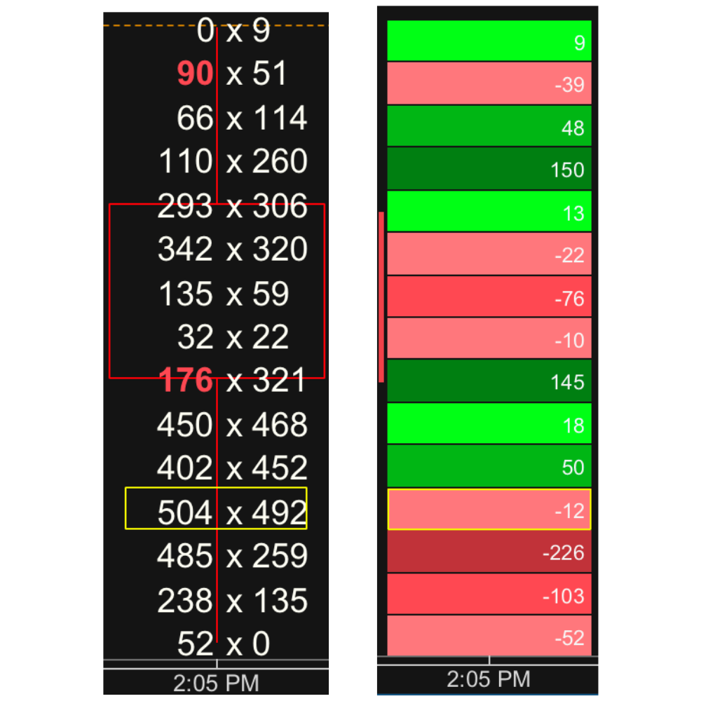
You can see at the lowest price point on the Bid/Ask Footprint (left) that 52 trades took place on the bid and 0 on the offer.
Delta = offer volume – bid volume
0 – 52 = -52 Delta
Let’s break out the calculation for the price level second from the bottom.
238 trades on the bid and 135 on the offer.
135 – 52 = -103 Delta
Note: Remember that trades that occur on the bid represent seller aggression and decrease delta. Where as trades that occur on the offer represent buyer aggression and increase delta.
Volume Footprint
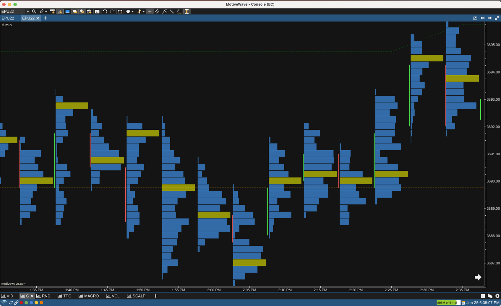
The third style of footprint chart is the volume footprint (above) also known as volume imprint or volume profile bar. A volume profile displays the amount of volume traded at each price level for a given user defined session. On the chart above the blue represents the amount of volume traded at each price level for a given 5 minute session. (POC is highlighted in gold)
You can also combine different footprint styles. Below is an example of a Bid/Ask Volume Footprint.
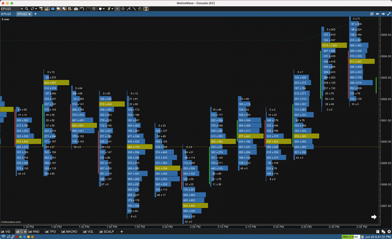
Should you decide to use Footprint Charts, odds are you will use multiple variations.
Personally I use longer time frame bid/ask charts when I’m looking for a buy or sell imbalance to a trigger a move away from fair value. I don’t use delta imprints simply because I already have a cumulative delta indicator on my scalping chart.
Finally, I use volume profiles (volume footprint) to determine whether price is imbalanced or balanced, and to determine support and resistance levels.
Now you have a basic understanding of what makes up a footprint chart and the different types. Next, let’s take a look at how you can begin to implement these charts into your trading.
Footprint Chart Strategies
Footprint charts are great for building context around your current strategies or developing entirely new ones.
Let’s get into some examples.
Stacked Buy and Sell Imbalances
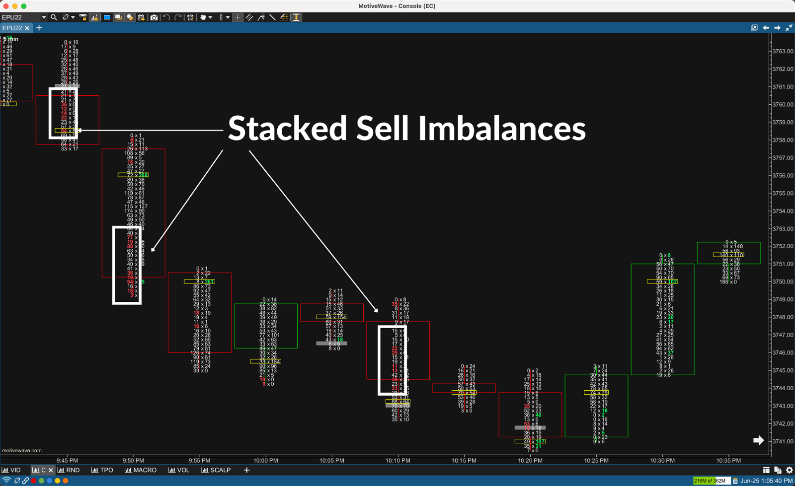
Stacked imbalances are simply multiple buy or multiple sell imbalances in a tight price range.
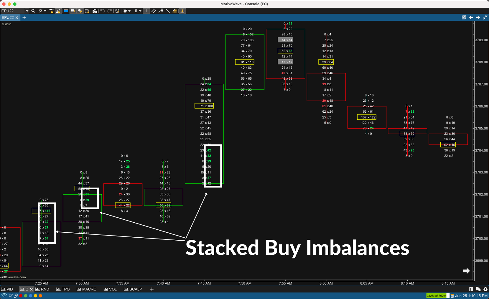
You can see the stacked buy imbalances highlighted by the white rectangles in the chart above. Stacked buy imbalances indicate strong buyer aggression indicating a potential breakout or the continuation of an uptrend.
Below you can see the stacked sell imbalances highlighted by the white rectangles . Stacked sell imbalances indicate strong seller aggression indicating a potential breakout or the continuation of a downtrend.
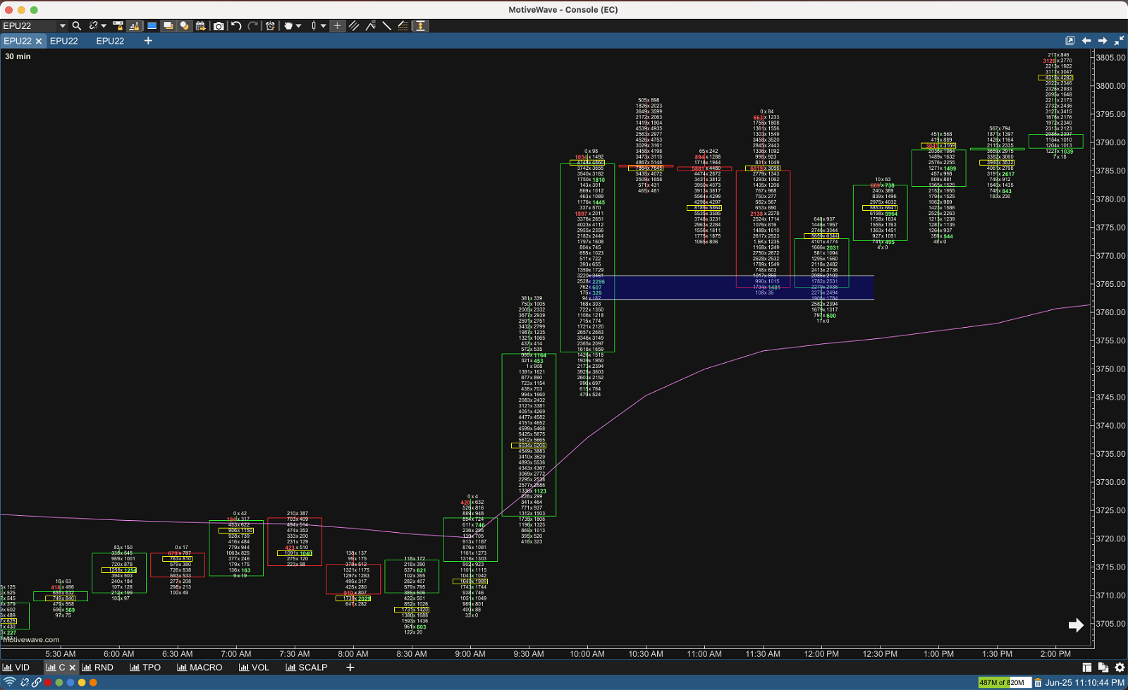
I like to have a longer time frame Bid/Ask footprint open during the day to project stacked imbalances zones forward to determine support and resistance levels. Notice how price retraced back to the stacked imbalance that formed during the 10:00 a.m. bar on the 30 minute chart below. Price briefly touched the imbalance zone and was immediately rejected and the uptrend continued. It makes logical sense since we already knew there were aggressive buyers at that level earlier.
Tip: Think of support and resistance as a zone or area, not a specific price point.
Unfinished and Finished Auctions (Business)
Up auctions (bullish moves) end at a price level above which no active buyers are willing to buy. The price has become too unattractive to the buyers. Likewise, down auctions (bearish moves) end at a price level below which no active sellers are willing to sell. When either of these have occurred we have a Finished Auction.
We can use the Bid/Ask Footprint Chart to identify when this situation occurs. Finished auctions will have zero on the bid at highs or a zero on the offer at lows. The zero bid tells us price couldn’t go a tick higher because there were no passive buyers looking to buy. The auction was finished.
Likewise, we can see where there were no passive sellers when there is a 0 on the offer.
At the bottom of the green bar (below) we had a price level where 419 contracts traded on the bid and zero on the offer. The 419 contracts on the bid were enough to consume all of the sellers demand and price didn’t trade a tick lower.
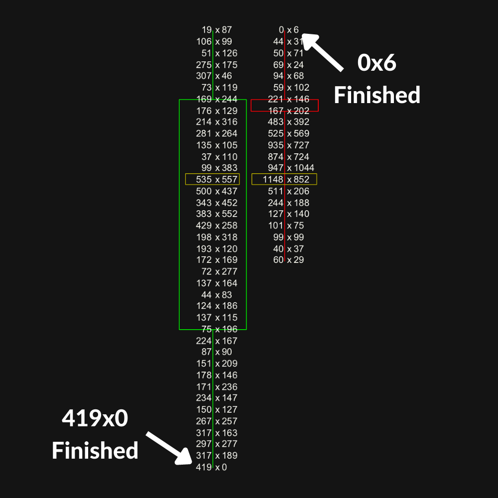
You can see another example of a finished auction at the highs of the red candle. The 6 contracts traded on the offer was enough liquidity to consume all of the buyer demand and price didn’t tick higher.
Unfinished auctions are represented by volume trading on the bid as well as the offer at a session high or low. Unfinished auctions at significant highs or lows provide logical take profits as we can understand the reasons why these price levels may be visited again in order to complete the market’s auction process.
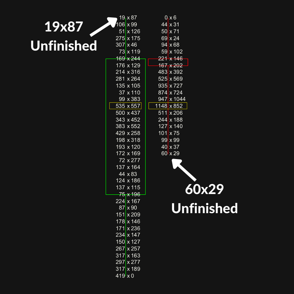
The 87 contracts purchased on the offer by buyers was enough to demand to take all of the liquidity on the offer and price ticked up followed by 19 contracts trading on the bid leaving us with an unfinished auction.
Remember from earlier, up auctions end at a price level above which no active buyers are willing to buy. In this example, price did not reach a level where active buyers were exhausted resulting in the unfinished auction.
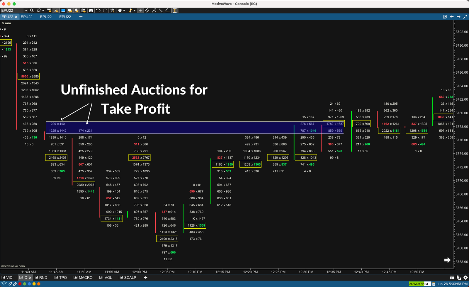
In the above example we had two unfinished auctions form at the highs of the 11:45 and 11:50 bars. Had you played a reversal setup during the next several minutes you could have used the unfinished auctions as your take profit target.
Delta Divergences
Delta divergences are another great pattern to trade.
Delta and price will typically move in the same direction. That makes sense right? If buyers are aggressively taking the offer then price should go up and if sellers are aggressively hitting the bid price should go down.
Notice I said typically… So what’s occurring when there’s divergence between price and delta?
On the 1 minute volume footprint below the bottom indicator is Delta Volume. It simply takes the value of delta for a session and plots it on a positive/negative bar graph allowing you to quickly see when price and delta are diverging.
In example 1 below, we have a strong negative delta as sellers were aggressively hitting the bid, yet the session still closed positive. Buyer’s withstood the sellers aggression and bid up price. A sign of a potential reversal coming or continuation of trend.
In example 2, buyers were aggressively taking the offer represented by the positive delta yet price closed lower. Sellers were able to withstand the buyers aggression and filled the books with offers bring price down. A sign of a potential reversal coming or continuation of trend. Obviously this one would have most likely been a losing signal.
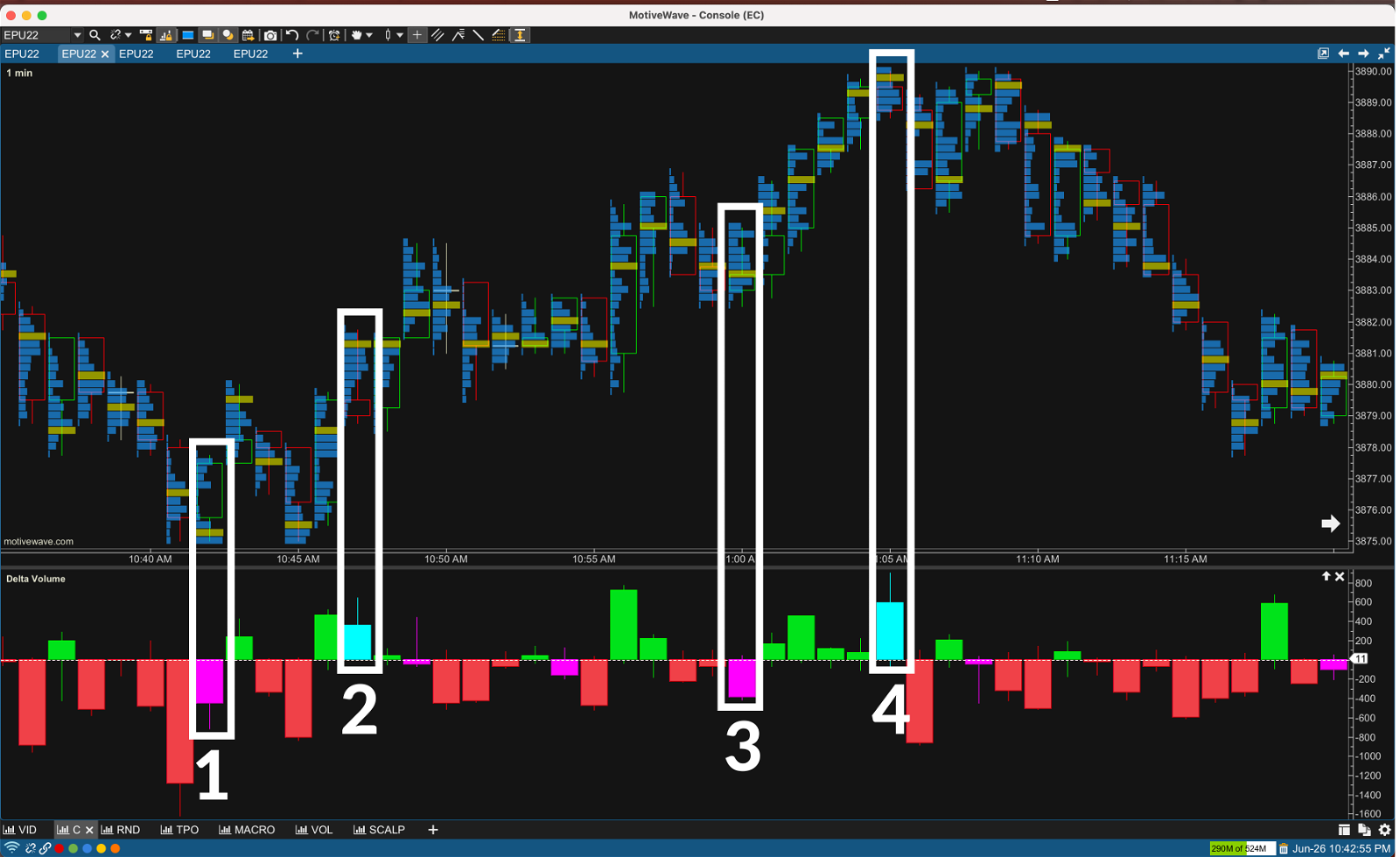
Can you guess what happened in 3 & 4?
If you’re interested in order flow, delta is an extremely powerful tool. Next you should dive deeper and read Volume Delta – The Ultimate Order Flow Indicator.
Note: Number 3 we had a strong negative delta yet price closed higher which in this case would have been a sign that the trend was going to continue. Number 4 we had a strong positive delta yet price closed lower which in this case would have been a sign that the trend was ending.
*I don’t believe you will be profitable just trading this individual pattern without additional context. Please make sure you backtest and sim trade any strategy before trading it live.
Volume Footprint Strategies
Volume always has a story to tell. In fact, I believe it’s the most important story the market has to tell. If you’re interested in trading order flow, volume will be at the core of your strategies.
High Volume Nodes & Point of Control
When using a volume profile there’s four critical pieces of information to observe.
High Volume Nodes (HVN): area of high volume relative to surrounding nodes
Low Volume Nodes (LVN): area of low volume relative to surrounding nodes
Point of Control: price level where the highest level of volume traded for a given session
Distribution: price in relation to HVN’s
High volume node’s act like gravity. They tend to attract price and try to hold it there.
Conversely, low volume nodes are areas with very little gravity. The market often rips right through these levels, not staying for long because there’s not much gravitational pull (resistance).
Let’s take a look at some examples of how you can use these.
POC’s and HVN’s are great for trailing your stop loss when in a position.
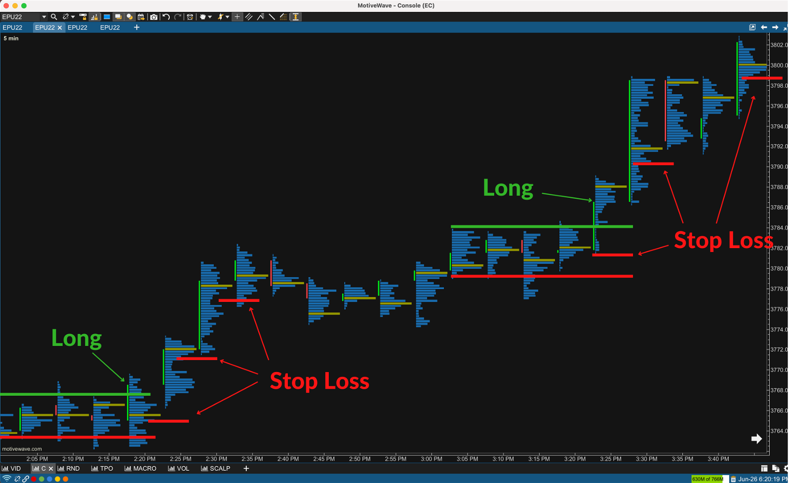
Let’s assume you saw several buy imbalances form as the 2:20 p.m. candle reached the upper end of the range it was trading in and decided to go long. A strategy you can use to help you stay in trends is trail your stop behind the POC’s and HVN’s that price last closed above in an uptrend or closed below in a downtrend.
The logic behind it is as price moves a way from a high volume node it indicates who the aggressor was in that price area. Therefore, in an uptrend you want to put your stop behind the areas where you know the buyers were more aggressive than sellers.
For those of you traders who currently trail candles that close at new highs or lows, this strategy will help tighten up your risk.
Next let’s take a look at how we can use HVN’s to find support and resistance levels.
HVN Support & Resistance
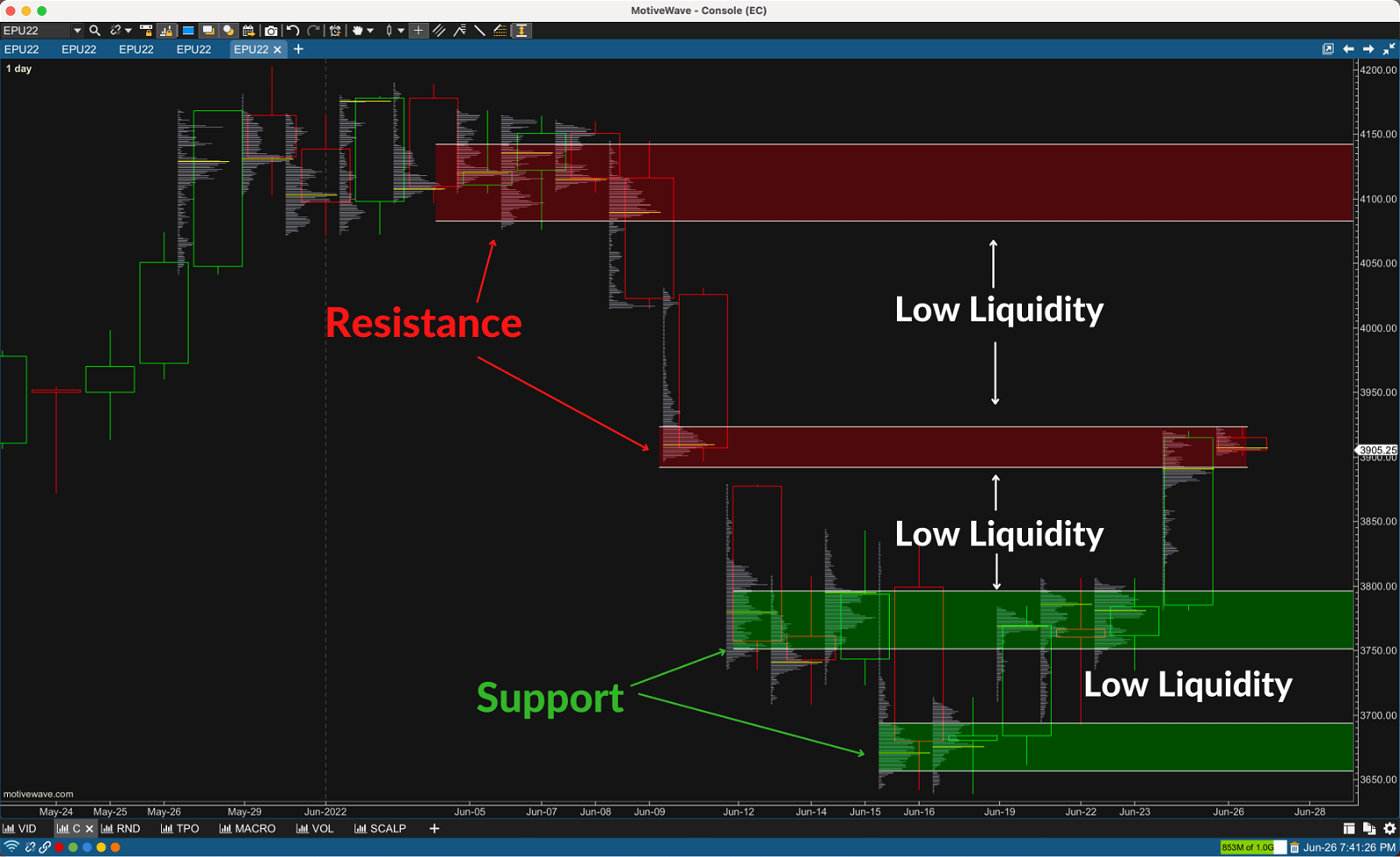
On the Daily Volume Footprint above you can see how the high volume nodes act as support and resistance. Also notice how price tends to shoot right through areas of low liquidity (LVN’s).
If I was looking at this chart in real time premarket I would be looking to play a breakout setup into the low liquidity area above or below. Remember there is very little resistance (low gravity) in low volume nodes.
Timeframe is key when picking your support and resistance levels. I’m primarily a short term scalper so long term for me is 30M, 1Hr, and 2Hr profiles. Yet I still do look at my daily and weekly levels every morning.
To get started I would skip the time frame above what you typically trade on and setup volume footprints on the next two or three time frames.
For example, if you primarily trade on the 5M time frame skip the 15M and look at the 30M, 1Hr, 2Hr.
b&P Reversal Profiles
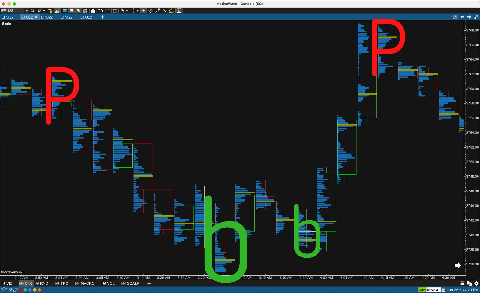
The volume profile allows us to quickly visualize potential reversals and the strength of a potential move.
You can spot potential reversals by the shape of the volume profile.
“b” shaped volume profile where the majority of the volume went off in the circle and price closed above are a sign of a potential bullish reversal as price goes into discovery away from the mean.
“P” shaped volume profiles where the majority of the volume went off in the circle and price closed below are a sign of a potential bearish reversal price goes into discovery away from the mean.

